A keyboard that became
a content system.キーボードが
コンテンツの仕組みに
なった。
As lead designer on ChromeOS, I led the redesign of the Chromebook keyboard and the new Quick Insert system that sits behind it: a single dedicated key that opens a cross-surface insertion layer for emoji, files, photos, links, and AI-generated content. The keyboard is the most muscle-memory-bound surface in computing: users build years of physical habit around it, and even a small change can throw that off. The work was as much about measuring and minimizing that disruption honestly as it was about the design itself.ChromeOSのリードデザイナーとして、Chromebookのキーボードを一から考え直し、その裏側に新しい仕組みQuick Insertを置きました。専用キー一つで、絵文字、ファイル、写真、リンク、AI生成物を、その場で呼び出して挿入できるレイヤーです。キーボードは、コンピュータの中でもっとも身体の記憶と結びついた部品です。人は何年もかけて指先の習慣を刻む。小さな変更一つで、その記憶が狂う。だから仕事の半分は設計で、もう半分はその影響を正直に測り、最小化することでした。
The OS was about to become multimodal. The input device wasn't.OSはマルチモーダルに向かう途中だった。入力装置は、そうではなかった。
In 2023 generative AI was rearranging what people could ask a computer to do. Output was about to be richer (text, image, audio, hybrid), and so was the input people wanted to give: a screenshot, a file, a recent photo, a Drive doc, half a thought. But the device sitting under their hands was still a single-channel typewriter. The keyboard could only carry words.2023年、生成AIが、コンピュータに頼める仕事の輪郭を引き伸ばした。出てくるものはもう、テキストだけではない。画像も、音声も、その混合も。入れたいものも同じだけ豊かになっていく。スクリーンショット、ファイル、昨日撮った写真、Driveのドキュメント、まだ言葉になっていない何か。ところが、手の下にある装置はタイプライターのままだった。キーボードは言葉しか運べない。
I framed the user problem as intent throughput. The idea in your head is one hundred percent signal. By the time you've translated it into something a computer can ingest (keystrokes, file pickers, copy/paste between four apps), you're down to twenty or forty. The computer interprets that, generates back, and you receive maybe twenty percent of what you originally meant. The whole pipe is leaking, and the worst leak is at the input end, where the user is doing all the carrying.これを意図のスループットの問題として整理してみる。頭の中にあるアイデアは、それ自体は100%の信号だ。それをコンピュータに渡せる形に訳した時点——タイピング、ファイルピッカー、アプリを四つ行き来してのコピーとペースト——で、信号は20〜40%まで落ちる。コンピュータがそれを解釈して返してくる頃には、手元に届くのは、よくても当初意図の20%。連鎖全体に漏れがあり、もっとも大きな漏れは入り口側にある。ユーザーがすべてを人手で運ばされている場面だ。
There was a second, more mundane problem layered on top: scattered context. The ingredients of any modern message live in five places: Drive, Gmail, Photos, Chat, the local file system, the clipboard. Bringing them into the surface you're typing in means leaving the keyboard, navigating, finding, copying, returning. Every modality switch is a tax on momentum.その上に、もう一つ、地味だが同じくらい面倒な問題が乗ってくる。文脈の散らばりだ。今どきのメッセージを成り立たせる素材は、いろんな場所に散らばっている。Drive、Gmail、Photos、Chat、手元のファイル、クリップボード。これらを今打ち込み中の画面に引き込むには、キーボードを離れ、移動し、探し、コピーし、もとの画面に戻る。モダリティを切り替えるたびに、勢いがその分ずつ削られていく。
下、Quick Insert以降。入口側をひとつの土台にたたみ込む。キー一打で、散らばっていた素材を打ち込み中の画面に呼び込めるから、途中で出ていく信号が減る。
Replace Caps Lock. Survive the backlash.Caps Lockをどける。社内の反発を設計で乗り越える。
A new physical key meant taking another one off. We chose Caps Lock: the least-justifiable key on a modern keyboard once you've actually looked at how often anyone uses it (or, in non-Latin locales, can't). It is also the most politically defended key, because every engineer, every reviewer, and every long-time user has muscle memory there. The internal backlash was substantial. Replacing Caps Lock looked, to many people inside Google, like a hostile act against their hands.新しいキーを一つ足すには、どこかを一つどける。選んだのはCaps Lockだった。使われている頻度を直視してしまうと、いまのキーボードの中でもっとも根拠の薄いキーだ(英字以外のロケールでは、そもそも使えない)。同時に、もっとも政治的に守られているキーでもある。エンジニアもレビュアーもベテランユーザーも、そこに指先の記憶を持っているからだ。社内の反発は相当なものだった。多くの人にとって、Caps Lockを替えるという話は自分の指先への敵対行為に映った。
My job stopped being “design a key” and became “build the evidence that lets us change a key.” I ran locale-by-locale studies of how Caps Lock is actually used (and how often it isn't), concept-tested Quick Insert against the same hand position, and ran muscle-memory studies to size the disruption honestly. The argument I packaged for VP review wasn't “this is a better key.” It was “Caps Lock has degraded into a footnote; Quick Insert scales with where computing is going; here is the data, here is the migration story.” The decision escalated to VP level and was approved.ここから仕事の中身が変わる。「キーをデザインする」から、「キーを変えるための根拠を組み上げる」へ。Caps Lockが実際にどう使われているか(と、どれだけ使われていないか)をロケールごとに調べ、Quick Insertを同じ指の位置でコンセプトテストにかけ、指先の記憶への影響量を見積もるための調査を回した。VPレビューへ持ち込んだ議論は「より良いキーです」ではない。「Caps Lockは脚注に退化している。Quick Insertは、コンピュータのこれからの行き先に合わせて拡張できる。データはこう、移行のしかたはこう。」決裁はVP層まで上がり、承認された。
Three more forks in the layout, each a small bet on where the OS is going.キーボードに加えたもう三つの小さな賭。OSがこれから向かう先を、配列の側に先に書いておく。
Quick Insert was the headline. But once a keyboard is on the table for change, the question becomes which other defaults still earn their place. I argued for three additional changes, each one a tiny ergonomic detail that signals what kind of computer this is.Quick Insertは見出しの話だった。ただ、いったんキーボードが「手を入れてよい部分」になると、他のデフォルトも、今もその場所にいてよいのかと問われ始める。もう三つの変更を提案した。どれも細かい話だけれど、「この装置がどんなコンピュータを目指しているか」を配列の上で語る要素だ。
A real G on the keyboard. Open “All apps.”キーボードにGoogleのGを初めて置く。Chromebook版のランチャーキー。
Mirroring how the Windows key works on Windows, I placed a Google G key in the bottom row to summon the launcher. The icon itself was contentious: Google had never put its corporate G on a keyboard before, and the brand guidelines around its use are strict. I ran iconographic studies and walked the brand team through every variant; the approval came with a tighter usage rule that we then carried through the OS.WindowsでのWindowsキーと同じ役割を、Gキーに任せる。ランチャーを呼ぶためのキーとして、最下段に置いた。このアイコンそれ自体が議論の的だった。Googleは自社のGマークをキーボードに乗せたことがなく、使用に関するブランドガイドラインも厳しい。複数のアイコン案を検証し、ブランドチームと一案ずつ詰めていった。最終的な承認はOS全体に通じる新しい使用ルールとセットで下りた。
A dedicated Accessibility key on the function row.ファンクション行にアクセシビリティキーを常設する
Most accessibility features live three menus deep. I put one on the function row at F11, customizable per user: assign your most-used a11y feature and call it from a single key. The argument I made: accessibility features are not only for “disabled” users; presented well, they help many more people. Surfacing one, by default, on the keyboard is the cheapest way the OS can say that out loud.アクセシビリティ関連の機能は、たいていメニューを三階層起こした先に埋もれている。これをファンクション行のF11にひとつ上げ、ユーザーごとにカスタマイズできるようにした。もっとも使うa11y機能を割り当てて、一打で呼ぶ。この議論の軽重はこうだ。アクセシビリティ機能は「障がいのある人」だけのものではない。見せ方を整えれば、もっと多くの人の助けになる。OSがそれを宣言するもっとも安い手段が、キーボードに常設することだ。
A Dictation key: voice as a first-class input.ディクテーションキー:音声を一級の入力に
Younger users who grew up on mobile aren't keyboard natives. They speak to their devices. I added a dedicated dictation key at F10 so voice input has the same standing as typing, present at the surface, one key away. Small detail, but it's the OS reading the room about who is going to be sitting in front of these laptops next.モバイルで育った世代は、キーボードに依存していない。装置に話しかける。F10にディクテーション専用キーを置き、音声入力にタイピングと同等の位置を与えた。表面にあって、一打で届く距離に。小さな話ではあるけれど、「このノートPCの前に次に座るのは誰か」をOSが読んだ、という仕草だ。
 PROTO · STICKER MOCK
 SHIPPED · FINAL LAYOUT
 MARKETING · SAMSUNG / BEST BUY
A system UI where you can insert anything, without leaving the keyboard.キーボードを離れずに何でも挿入できるシステムUI
The pitch is one sentence: one key to grab and insert anything. In the surface itself, “anything” is unpacked into a ranked, searchable layer: emoji, GIFs, recent files, recent photos, links from your tabs, AI-generated text or image, and clipboard history. Caps Lock, the key that was displaced, also lives here as a toggle, rehoused at its actual usage frequency rather than killed.提案を一行に絞ると、「あらゆるものを掴んで挿入する一つのキー」です。その要素の中では「あらゆるもの」がランク付きの検索可能なレイヤーに展開されます。絵文字、GIF、最近のファイル、最近の写真、開いているタブのリンク、AIで生成されたテキストや画像、クリップボード履歴。位置を譲ったCaps Lockも、ここにトグルとして残しています。機能を消すのではなく、実際の使用頻度に見合う場所へ移した、という整理です。
Below: a single send. The user is in Gmail Chat replying with a music recommendation. They press Quick Insert, type “bill ev,” select a YouTube result, hit Enter, and the link inserts and unfurls in place. Seven frames; no app switch.下のフロー。ユーザーはGmail Chatで返信中、音楽の薦めを送ろうとしています。Quick Insertを押す。「bill ev」と打つ。YouTubeの結果を選び、Enterを押すと、リンクが挿入され、その場で展開される。フレーム七枚、アプリ切り替えはなし。
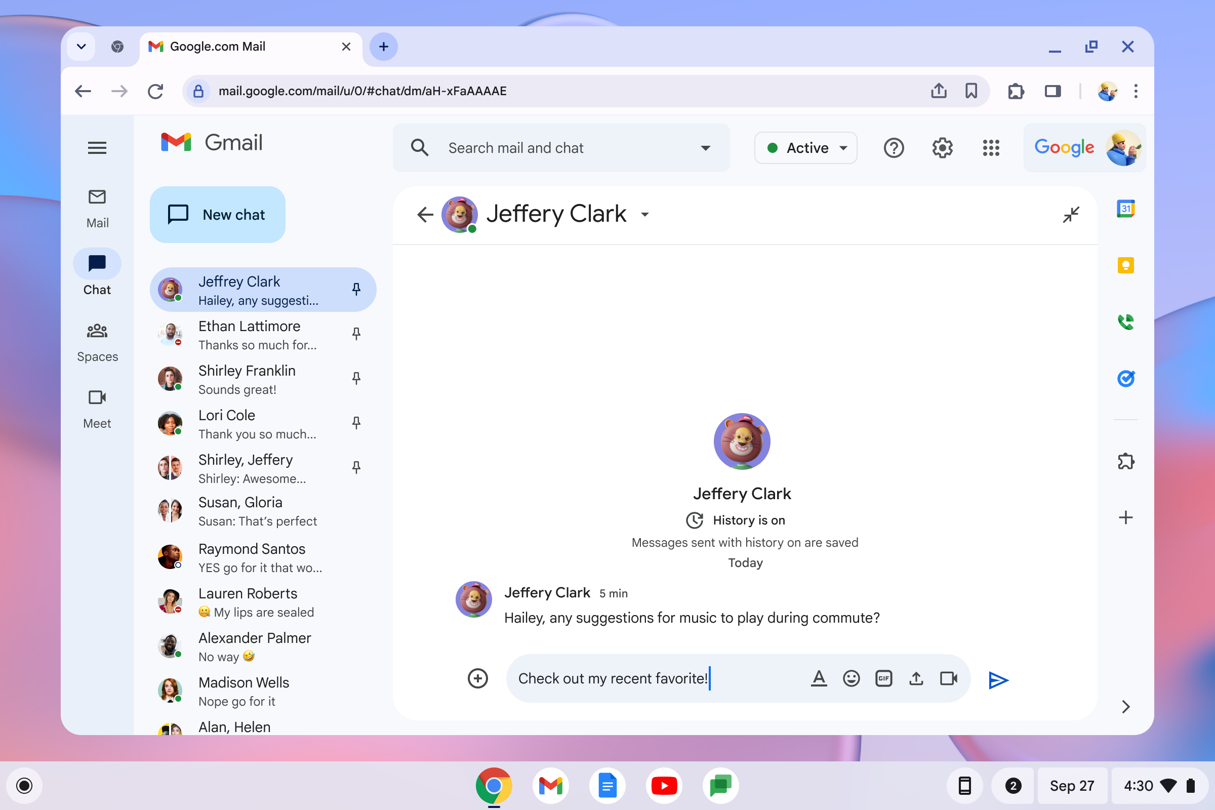 01Composer at rest
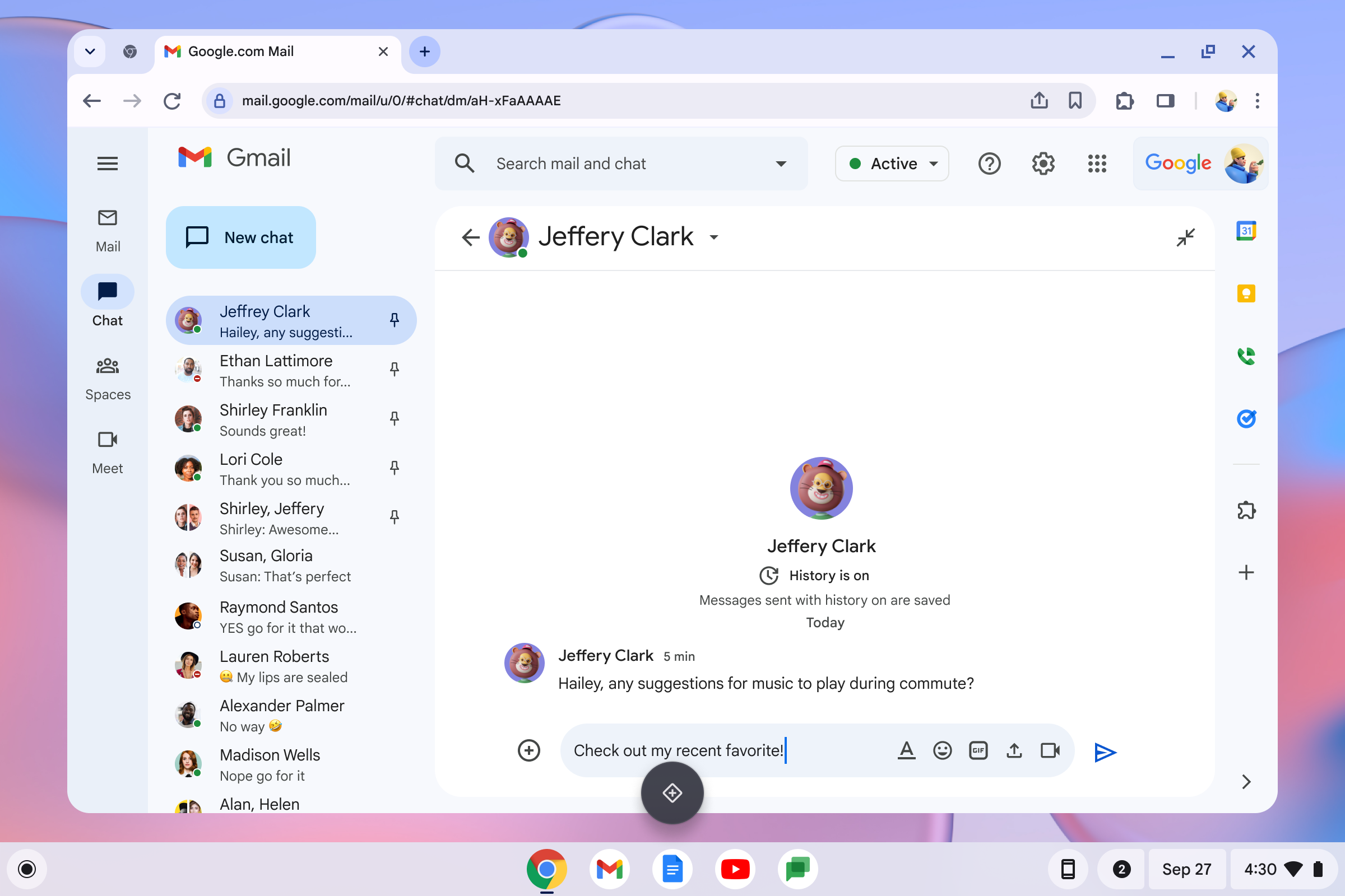 02Quick Insert invoked
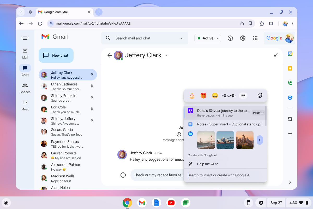 03Surface opens
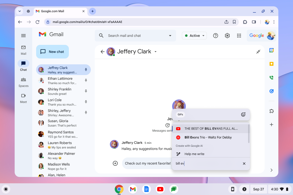 04Type “bill ev” · results
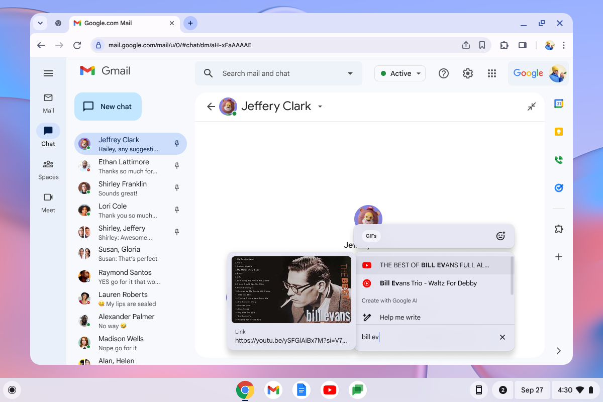 05Select & confirm
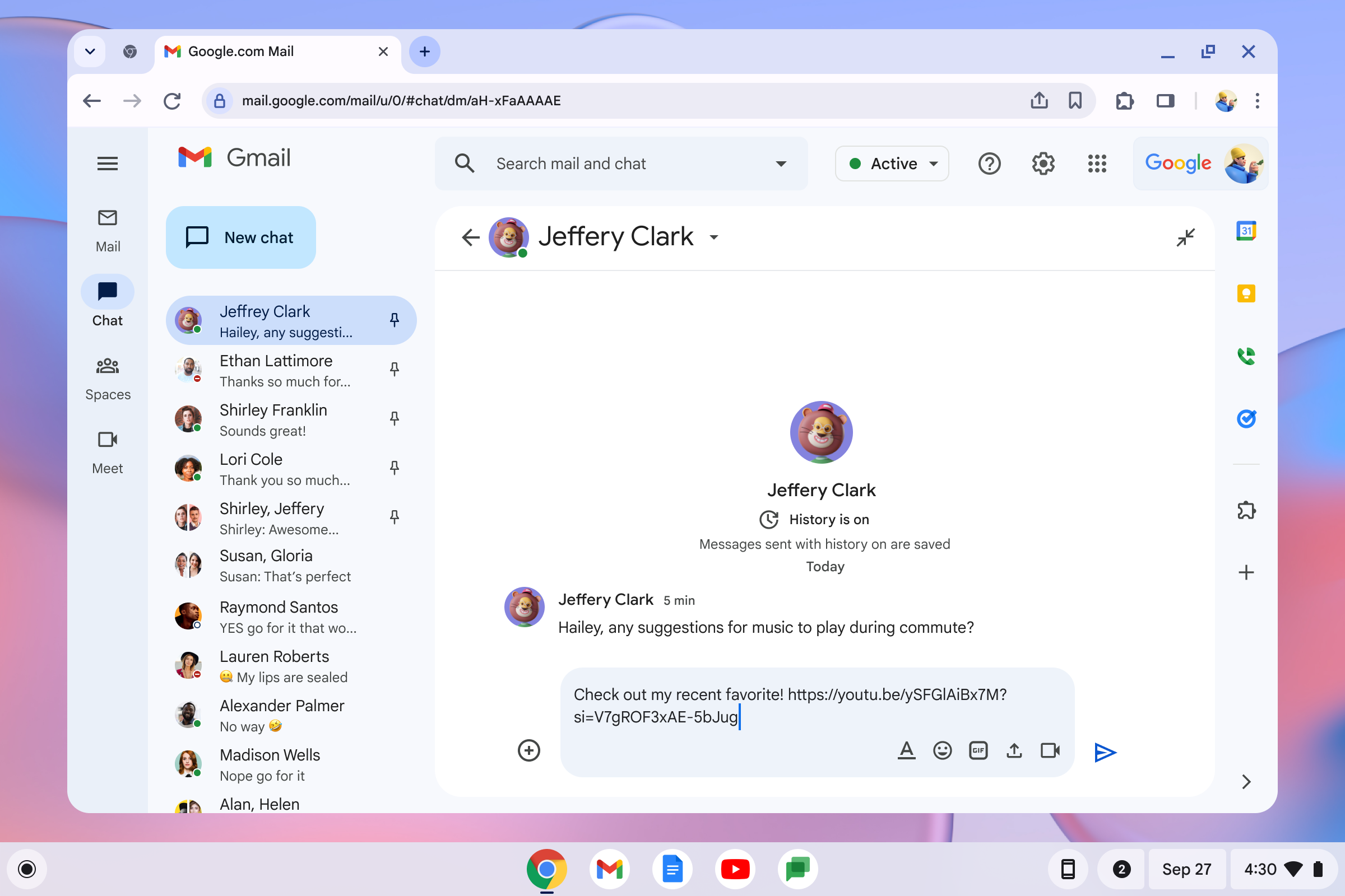 06Link inserted
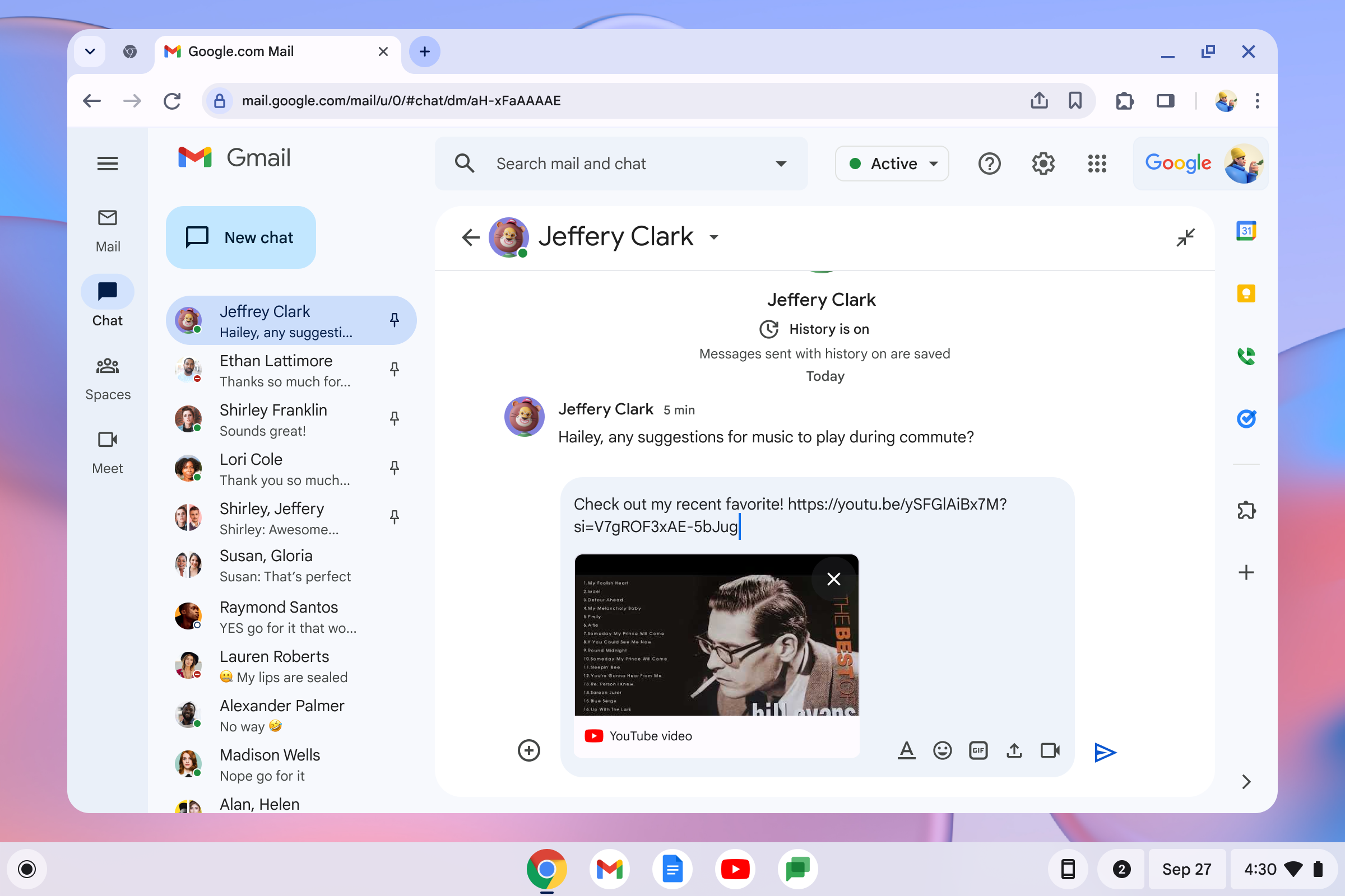 07Unfurled in place
The keystroke is loud. The surface had to be quiet.キーの一打は大きく。要素は、静かでなければならなかった。
The whole bet was that one keystroke replaces multiple app switches. That only pays off if the surface itself feels effortless: fast to summon, fast to read, fast to dismiss.この賭けは「一打が複数のアプリ切り替えを置き換える」というものでした。賭けが報われるためには、開いた要素そのものが軽くなくてはなりません。速く呼べて、速く読めて、速く閉じられる。
- Single search field, mixed results. No tabs to choose between “files” and “emoji” first. The query routes itself across sources, ranked by recency and relevance, the way the user is actually thinking.検索は一本、結果は横断。「ファイル」「絵文字」をタブで選ばせない。クエリが内部でソースを横断し、最近性と関連性で並ぶ。ユーザーの頭の中の動きに合わせる。
- Hover preview, Enter to confirm. Keyboard navigation is first-class: the whole interaction can complete without the trackpad ever moving. A user who reaches for the trackpad has been failed.ホバーでプレビュー、Enterで確定。キーボード操作を一級の動線として設計し、トラックパッドを動かさずにすべて完結できるようにしました。ここでトラックパッドに手が伸びたら、設計の負けです。
- Two doors to the same room. Power users hit the key. New users come in from the launcher. The surface is identical, so the muscle memory transfers in either direction.同じ部屋に二つの入口。パワーユーザーはキーから入り、新規ユーザーはランチャーから入る。中の要素は同じなので、どちら方向にも筋肉の記憶が引き継がれる。
- Caps Lock rehoused, not killed. The displaced function lives in the same surface as a toggle, at the frequency it actually deserves. This was the structural answer to the loudest internal objection.Caps Lockは消さず、住み替えさせる。位置を譲った機能は、同じ要素の中にトグルとして残しました。実際の使用頻度に見合うかたちで。社内最大の反論への、構造的な答えです。
60 million Chromebooks already in the world. A new keyboard and a new tier, landed across all of them.Chromebookは既に6,000万台出荷されている。そこに新しいキーボード、新しいハードウェアティアを届けた。
There are roughly 60 million Chromebooks in the world. The Quick Insert keyboard was the headline of the new Chromebook Plus tier, Google's first new hardware category in the lineup in years, and shipped most prominently on the Samsung Galaxy Chromebook. The layout is now the reference keyboard for ACER, Lenovo, Samsung, HP and other OEMs, and is being carried into Google's next-generation desktop OS. Changing one key on one laptop is a feature. Changing the default layout an entire ecosystem builds against is a platform shift.世界にはおよそ6,000万台のChromebookがあります。Quick Insertのキーボードは、新ティアChromebook Plusの見出し機能として登場しました。Googleがラインアップに何年ぶりかで投入する新しいハードウェアカテゴリです。Samsung Galaxy Chromebookではその核として打ち出されました。配列はいまやACER・Lenovo・Samsung・HPなどのOEMにとってのリファレンス・キーボードであり、Googleの次世代デスクトップOSにも引き継がれています。一台のノートPCで一つのキーを変えるのは「機能の追加」です。エコシステム全体が前提とするデフォルト配列を変えるのは、プラットフォームの方向転換です。
Designers who think across hardware and software as a single UX problem are rare. Rio has shipped it at OS scale.ハードウェアとソフトウェアをひとつのUX問題として設計できるデザイナーは少ない。私はそれをOS規模でリリースしてきました。
Changing a key, a default, or a system primitive is half design and half evidence. Rio brings the research, the executive narrative, and the cross-org choreography it takes to land changes that look obvious in retrospect, and the design craft to make them feel inevitable.キーを変える、デフォルトを変える、システムのプリミティブを変える。これは半分が設計、半分が根拠の構築です。私は、結果から見ると当たり前に見える変更を成立させるためのリサーチ、経営層に届くナラティブ、組織横断の段取り、そして「自然に見える」を成立させる設計の手仕事を、一つの仕事として持ち込みます。